The problem
The method of measuring cardiac output by pulse contour analysis requires calibration by another method. There are several reasons for this, including different size, build and age of patient. When comparing cardiac output measurements by pulse contour analysis with those obtained by another method, it is misleading to pool the results from all patients in the form of an X-Y plot as in the next figure, where Method A is a pulse contour method and Method B is a calibration method such as thermodilution.
The reason this is misleading is that if there are several different patients, then an apparently good agreement (as above) may exist because the calibration values are different and for each patient there is little change in cardiac output about the calibration point for that patient. In the following figure, it is revealed that the points in the graph above came from 4 different 'patients'. As you can see there is no correlation between the two methods within each patient, so the apparently good corrleation above was purely due to different calibration values. The points within each of the colour groupings were obtained by random number generation!

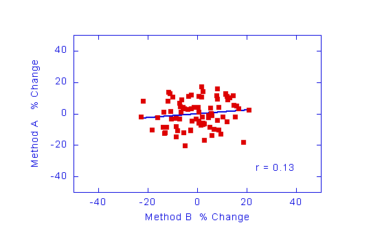
What you need to know is whether the pulse contour method is able to follow changes in cardiac output within an individual patient. One way of looking at this is to plot the percentage changes in cardiac output measured by one method against the percentage changes measured by the other. In the figure below, the data in the top two graphs has been presented in this way.