Display
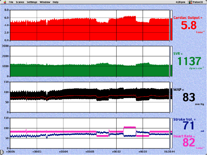
This shows the software display. The red trace shows cardiac output (l/min). The green trace is systemic vascular resistance (SVR) measured in dyn s cm -5. The black trace is arterial pressure, with the red line indicating the mean value. In the lowest panel the blue line shows stroke volume (ml) and the pink line shows heart rate. The vertical lines show intervals of 1 minute and the screen scrolls from right to left. The data from each beat is plotted separately giving an immediate response time; although this results in occasional artefacts an immediate response time is crucial.
In the above example the patient was 72 years old, weighed 92 kg and had just had a mitral valve replacement for mitral regurgitation. This display was seen soon after cardiopulmonary bypass was discontinued. Initially the heart is being paced at 80/min. There is an obvious systolic pressure variation which disappears as he is transfused. This transfusion produces an increase in cardiac output (red trace) due to an increase in stroke volume (blue trace). The pink trace shows alterations in pacing rate. It can be seen that reducing the rate from 80 to 60/min caused a significant fall in cardiac output. Increasing the rate from 80 to 100/min produced only a small increase in cardiac output and therefore in this patient the optimal rate appeared to be 80/min which provided the best combination of an adequate cardiac output and reasonable diastolic time for coronary flow. As expected, changing the pacing rate only has a small immediate effect upon SVR (green trace).